Creating Chart
Virtutem Analytics provides an easy to use drag and drop interface to create charts fast & easy. You can create various types of charts including Bar, Line, Pie, Stacked, Scatter, Funnel, Web and 3D charts by simply dragging and dropping the required columns in to the respective Shelves (X-axis, Y-axis, Color,etc.,) in the design area. It is also easy to change the chart type any time dynamically with out recreating the chart. You can also apply the appropriate aggregate functions on the columns to calculate and summarize data the way you want it.
To create a chart, follow the steps given below:
- Open the reporting database in which you would like to create a chart.
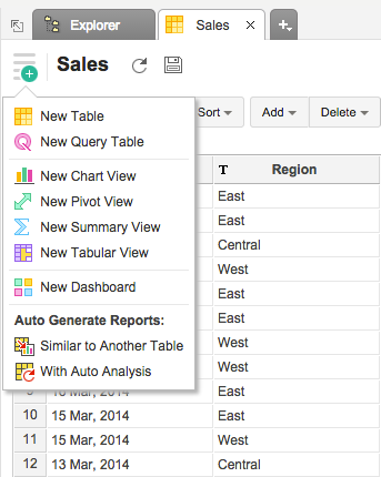
- Click New Report button in the top left corner of the database.
- In the New Reports tab that opens, click Chart View .
- In the Select Base Table dialog box that opens, select the required table in your database on which you want create the chart and then click OK .
- This opens the Chart Designer (also known as Chart Edit Design Mode ) as shown below.
You can also create new chart by opening the corresponding data table on which you want to create the chart and invoking the New -> New Chart View option in the toolbar.
| Note: |
|---|
| You can also create charts over a Query Table following the same instruction given above. |
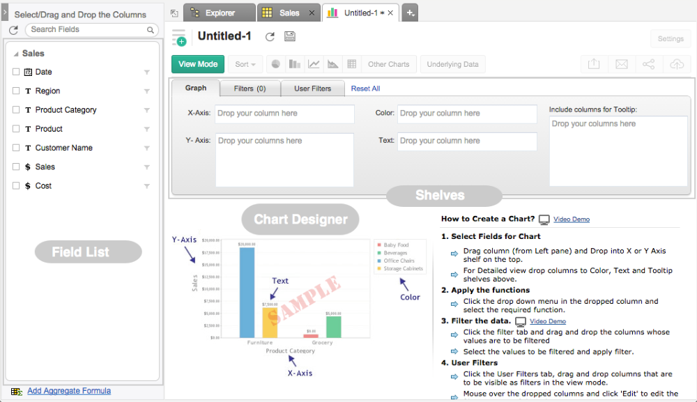
In Edit Design mode , you will notice all the columns of the selected table listed on the left side Column List pane . On the right hand side, you can see the Design Area with shelves to drop the columns and a preview area below to view chart created.
Drag and drop the required columns listed in the Column list pane into the respective shelves in the Graph tab . You can also Select the check box adjacent to each column listed to auto place the columns into the appropriate shelves. After dropping the columns click on the option Click here to Generate Graph to create the new chart.
Below is a brief description of each of the shelves in the Graph tab .
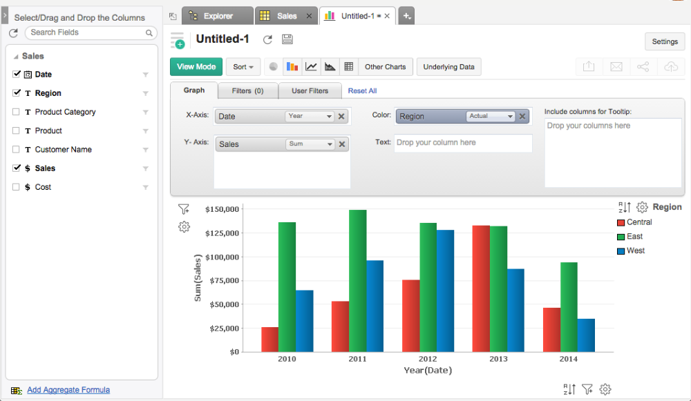
Here is an example to illustrate how to create a simple bar chart. We will create a Sales trend across years chart using a sample store sales data. Drag and drop the Date and Sales columns to X and Y - Axis and click Click here to Generate Graph . Once the link has been clicked, a bar chart will be created as shown below in the screen-shot.
- Color : When a column is dropped in this shelf, the chart will be further categorized showing each data point in this column in different colors (different data series) in the chart.
Continuing the above example, for instance, if you want to create Date-wise Sales by Region chart, drag and drop Region column in to the Color shelf . Now, the chart will be further categorized based on Region and each region will be assigned a unique color as shown in the below screen-shot.
- Text : Includes the corresponding value of the dropped column as data label in the chart, according to the function applied on the column.
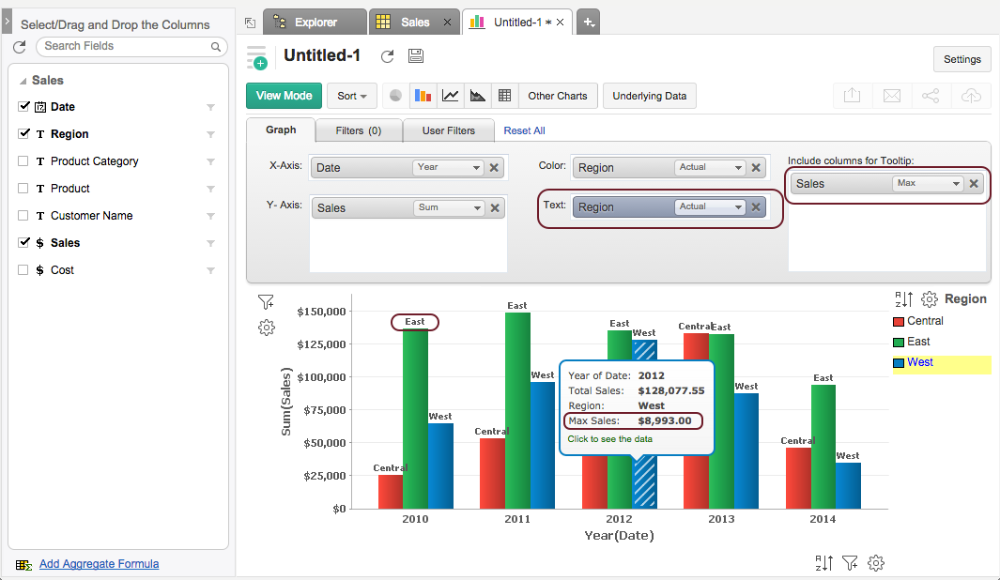
- Include columns for Tooltip : Includes the corresponding value of the dropped columns in the chart tool-tip, according to the function applied on the column.
Following screen-shot describes how would a chart look like when Text and Include columns for Tooltip options are selected.
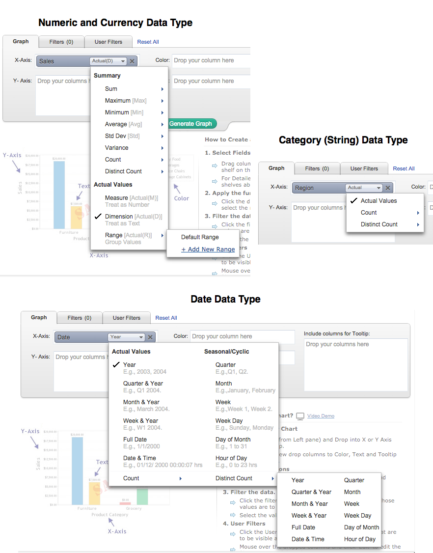
Virtutem Analytics allows you to apply aggregate/categorical functions like Sum, Count, Average, Min, Max, etc. , on the data columns to group and summarize data in charts. When you apply a function on a column, a single value will be returned, derived based on the values in the column. The default function for a Numeric (including Currency ) data type is Sum and for a Date data type is Year . If the data type of the column is string (Categorical/Dimension column) and not numeric, then the default function applied is Actual Values.
To change the default function applied, after dropping the column, select the required function (aggregate/categorical) from the drop-down list present on the column. Drop-down list displays all the applicable functions based on the data type of the column, as shown in the screenshots below.
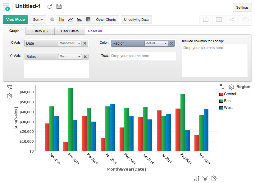
For instance, if you want to plot Average Sales for each Month across each Region , select Average function from the drop-down list for Sales (Y Axis) column, Month & Year function for Date (X Axis) column and select Actual Values function for Region (Color column) and then click Click here to Generate Graph link .
The following tables list all the functions along with the description of their functionality.
Numeric and Currency Data Types:
| Function | Description |
| Sum | Returns the sum of all the values in the column. The summation will be done at each category/group level shown in the report. |
| Maximum [Max] | Returns the maximum value in the column. |
| Minimum [Min] | Returns the minimum value in the column. |
| Average [Avg] | Returns the average of all the values in the column. |
| Standard deviation | Returns standard deviation derived based on all values in the column. |
| Variance | Returns the variance of the column. |
| Count | Returns the count of the number of values in the column. |
| Distinct Count | Returns the count of the number of distinct values in the column. |
| Measure | Treats the values in the column as a measurable numeric value. Returns each distinct value present as a numeric value to be plotted in the report. |
| Dimension | Treats the values in the column as a textual (categorical/dimensional) value. Returns each distinct value present as a text value to be plotted in the report. |
| Range | Groups the entire range of numeric values present in the column into multiple ranges.. e.g., if your data range is between 0 to 1000 then it will be grouped as 0 to 100, 101 to 250 ... 901-1000. You can also specify the custom range size to group the data using the Add New Range link. i.e., in the aforesaid range if you set the Range Size as 50, then it will be grouped as 0 to 50, 51 to 100 .... |
Date Data Type - Actual Value Functions:
| Function | Description |
| Year | Returns all distinct year values present in the column. E.g.,2003, 2010 |
| Quarter & Year | Returns all distinct quarter & year values present in the column. E.g., Q1 2010 |
| Month & Year | Returns all distinct month & year values present in the column. E.g., March 2010 |
| Week & Year | Returns all distinct week of the year values present in the column. E.g., W1 2010 |
| Full Date | Returns all distinct dates present in the column. E.g., 1/1/2011 |
| Date & Time | Returns all distinct date and time pairs present in the column. E.g. 01/12/2010 00:10:07 hrs |
Date Data Type - Seasonal Value Functions:
| Function | Description |
| Quarter | Helps identifying seasonal trends based on quarters present across all years in the column. E.g., Q1, Q2. |
| Month | Helps identifying seasonal trends based on months across all years. E.g., January, February. |
| Week | Helps identifying seasonal trends based on weeks across all years. E.g., Week 1, Week 2. |
| Week Day | Helps identifying seasonal trends based on week day across all years. E.g., Sunday, Monday. |
| Day of Month | Helps identifying seasonal trends based on day of month across all dates. E.g., 1 to 31. |
| Hour of Day | Helps identifying trends across hours in a day. E.g., 0 to 23hrs. |
Date Data Type - Aggregate Function:
| Function | Description |
| Count | Returns the number of date values in the column. |
| Distinct Count | Returns the number of distinct date values in the column. |
String(Categorical/Dimension) Data Type:
| Function | Description |
| Actual Values | All the distinct values in the column will be listed. |
| Count | Number of values in the column will be listed. |
| Distinct Count | Number of distinct values in the column will be listed. |
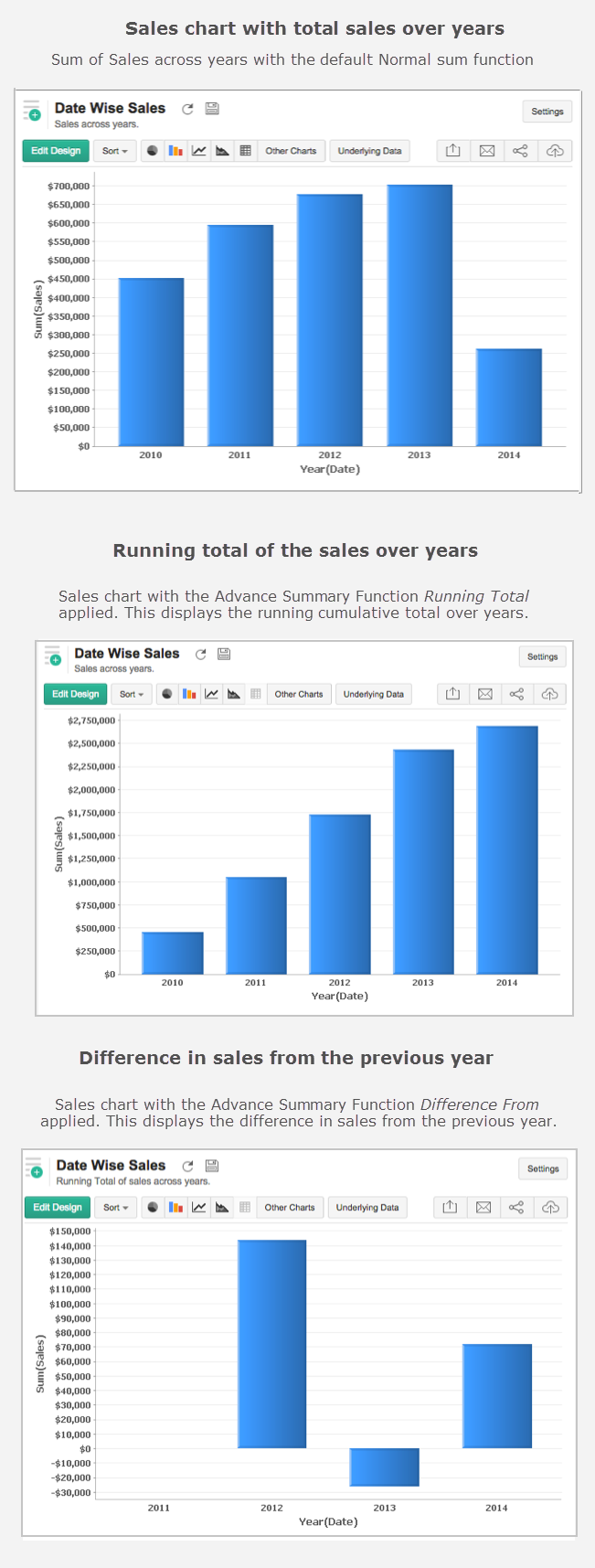
When creating a chart, Virtutem Analytics provides advanced summary functions, apart from the basic functions such as Sum, Max, Min or Average. This allows you to summarize data values in a column based on other values in the column. Using this you will be able to plot some powerful calculations on a chart like running total of sales over years or calculate the difference in sales from the previous year etc.,
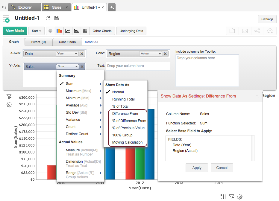
Following are the functions available for advanced summarizing options:
| Function | Description |
| Normal | Displays the calculated value of the aggregate function applied over the column. By default this option will be selected. |
| % of Total | Displays the percentage of the grand total of all the data in the chart series. |
| Running Total | Displays data in successive data points of the chart as a running total, based on the selected Base Field. |
| Difference From | Displays the data in each data point as the difference from the value in the previous data point, based on the selected Base Field. |
| % of Previous Value | Displays the data in each data point as a percentage of the value in the previous data point, based on the selected Base Field. |
| % of Difference From | Displays the data in each data point as a percentage of differences from the value in the previous data point, based on the selected Base Field. |
| 100% Group | Displays the percentage of the data point value in total of the group, based on the selected Base Field. This will be useful for creating 100% Stacked Bar and 100% Stacked Area Chart. |
| Moving Average | Displays the calculated moving value of each data point based on the inputs you provide. The summary function selected will be taken as the base for calculation. You can perform sum, average, minimum and maximum calculation using this. |
The following screenshot illustrates a sample chart with different advanced summary functions applied.
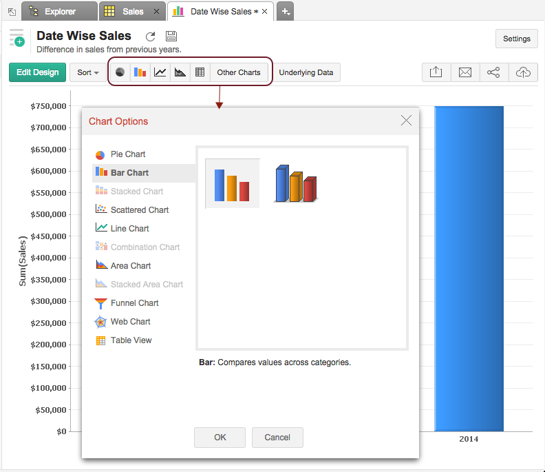
After creating a chart, you can easily change it to another chart type at a click of a button with out changing the plotted data. For example, you have created a Bar chart, but then decide that you want the data to be displayed as a Pie chart. You can do this by changing the chart type using the tool bar or you can use Other Charts button on the toolbar.
Tool bar provides you with the options to choose between Pie, Bar, Stacked Bar, Line, Scatter and Table chart types at the top level. If you do not find the chart type that you are looking for, then click on Other Charts button in the toolbar and select the chart type that you want to apply from the Chart Option dialog box that appears. You can view a brief description of each chart type the bottom of the dialog box by clicking on the specific chart type. Notice that chart types that are not applicable/unsupported for the combination of columns that you are using to create the chart will appear disabled.
After selecting the required chart type in the dialog box, click OK .
The following table describes the various Chart types supported by Virtutem Analytics:
| Chart Type | Description |
| Pie
| Pie chart is a circular chart divided in to sectors. It plots the contribution of each value to the overall total expressed in percentage. |
| Pie 3D | Pie chart with a 3D visual effect. |
| Ring | Ring chart plots the data in a ring. It displays the contribution of each value to the overall total expressed in percentage. |
| Funnel | Funnel chart plots series of data in a funnel shape. Useful to plot values in a process/stage oriented data set. |
| Bar | Bar (Column) chart plots data as sets of vertical bars. Displays values as individual bars whose height is determined by the value plotted and grouped by each category |
| Bar 3D | Bar chart with a 3D visual effect. |
| Stacked | Stacked bar chart plots the contribution of each value to the total across categories. |
| Stacked 3D | Stacked bar chart with a 3D visual effect. |
| Scattered | Scattered chart plots values as a set of points. |
| Line | Line chart displays data as a series of points connected by a line. |
| Line with Points | It is a Line chart with markers displayed at each data value point plotted. |
| Step | Step chart is similar to the line chart where data points are connected by steps (up or down) instead of straight lines. |
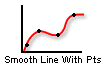
| Smooth Line
| Smooth Line chart connects the data points with a smooth curve. |
| Smooth Line with Points
| This is a Smooth Line Chart with markers displaying the data point. |
| Combo Bar
| Combination chart compares value across categories.Combo Bar is a combination of bar and line chart. |
| Combo Bar 3D
| Combo Bar 3D is a combination of 3D bar and line chart. |
| Combo Stacked
| Combo Stacked is a combination of stacked bar and line chart. |
| Combo Stacked 3D
| Combo Stacked 3D is a combination of stacked 3D and line chart. |

| Smooth line chart can also be applied in Combination charts using the Use Smooth Line check box. Combo Bar and Smooth Line is a combination of bar and smooth line chart. |

| Combo Bar 3D and Smooth Line is a combination of 3D bar and smooth line chart. |

| Combo Stacked and Smooth Line is a combination of stacked bar and smooth line chart. |

| Combo Stacked 3Dand Smooth Line is a combination of stacked 3D and smooth line chart. |
| Area | Area charts is similar to a line chart, but with all the area below the line filled with a color. |
| Area with Points | It is an Area chart with markers displayed at each data value point plotted. |
| Stacked Area | Stacked Area chart is an Area chart, where the contribution of each data series is stacked over the previous one |
| Stacked Area with Points | It is a Stacked Area chart with markers displayed at each data value point plotted. |
| Filled Web | Filled Web is a two-dimensional chart of three or more quantitative variables represented on axes starting from the same point. |
| Web | Web Chart displayed without filling color shade. |
| Table View | Tabular Data View of the chart |