Customizing a Chart
When designing a chart, Virtutem Analytics offers wide range of options to customize the chart and improve the overall appearance in different ways. In this section we will discuss about various options provided by Virtutem Analytics to customize the chart that you create.
Virtutem Analytics provides options to add title and description of the chart when creating the chart. You can change the title as description at any time using the Settings screen.
To change the existing tile and description of a chart, follow the steps given below:
- Open the corresponding chart.
- Click Settings option in the toolbar. The Settings screen General tab will open as shown in the following screenshot.
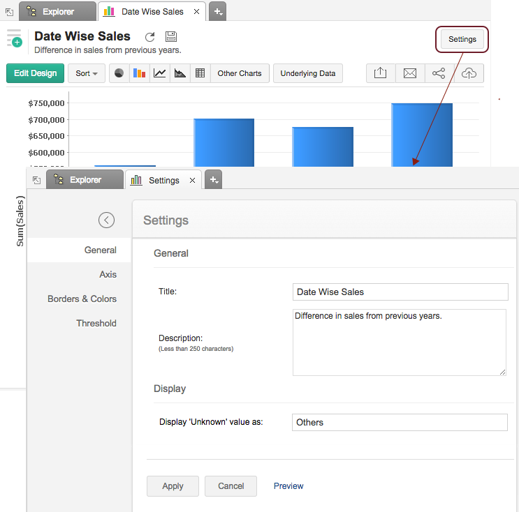
- Enter/modify the title and description of the chart into corresponding text boxes.
- Click Apply.
Virtutem Analytics will automatically set values for chart axes properties such as X-axis and Y-axis labels, axis range, interval between labels, etc., while creating a chart. You can also customize these properties to suit your needs using the Axis tab in the Settings screen.
To customize axis settings:
- Open chart and then click Settings option in the toolbar.
- The Settings screen will open. Click the Axis tab. You can also open the Axis tab by clicking the settings icon
![]() next to X/Y Axis in Edit Mode.
next to X/Y Axis in Edit Mode.
.png)
The following table describes various options available in Axis tab.
| OPTION | DESCRIPTION |
| X Axis | |
| Label | This option consists of two fields. They are: Name - Text field to specify the name of the X-axis. By default, the name of the corresponding column will be set as axis label. |
| Tick Marks | Font: This option is used to set the font style of the tick marks in X axis. It contains a multi-column drop-down displaying options to customize the font style, size and color of the tick mark. Direction : This option can be used to set the orientation of X-axis tick labels. Available options are: Auto - Align the tick labels in the most appropriate direction based on the number of characters in the tick label. |
| Range | Virtutem Analytics will automatically calculate the X-axis range based on the maximum and minimum values in the data series. If required, you can set a custom range by selecting the Range check box and then entering the maximum and minimum values in the corresponding fields. This option will be available only when numeric data columns are added to the X-axis and the chart type is set to Line, Area or Scatter chart. |
| Interval | Virtutem Analytics will automatically determine the interval between axis labels based on the axis label length and the size of the chart. If required, you can set a custom interval by selecting the Interval check box and then enter the interval value in the corresponding field. This option will be available only when numeric data columns are added to the X-axis and the chart type is set to Line, Area or Scatter chart. |
| Y Axis | |
| Label | This option consists of two fields. They are: Name - Text field to specify the name of the X-axis. By default, the name of the corresponding column will be set as axis label. |
| Tick Marks | Font: This option is used to set the font style of the tick marks in X axis. It contains a multi-column drop-down displaying options to customize the font style, size and color of the tick mark. Direction : This option can be used to set the orientation of X-axis tick labels. Available options are: Auto - Align the tick labels in the most appropriate direction based on the number of characters in the tick label. |
| Data Label | This option can be used to display Y-axis values as data labels in the chart. On selecting this option a text string which displays the Y value corresponding to each data point will be added. |
| Range | Virtutem Analytics will automatically calculate the X-axis range based on the maximum and minimum values in the data series. If required, you can set a custom range by selecting the Range check box and then entering the maximum and minimum values in the corresponding fields. This option will be available only when numeric data columns are added to the X-axis and the chart type is set to Line, Area or Scatter chart. |
| Interval | Virtutem Analytics will automatically determine the interval between axis labels based on the axis label length and the size of the chart. If required, you can set a custom interval by selecting the Interval check box and then enter the interval value in the corresponding field. This option will be available only when numeric data columns are added to the X-axis and the chart type is set to Line, Area or Scatter chart. |
| Note: |
|---|
The Axis tab is not applicable for Pie and Web chart types, as they do not have any axis. |
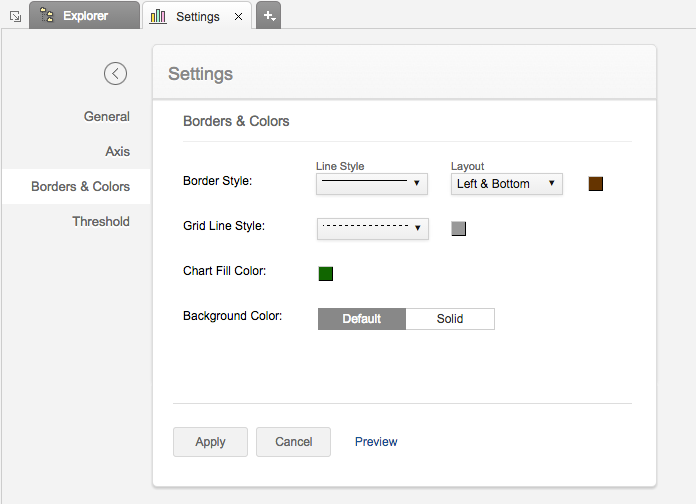
When a chart is created, Virtutem Analytics will set the default background and border for the new chart. However, you can customize these setting to enhance the look and feel of the chart. The Borders & Colors tab in the Settings screen provides various options to customize the chart appearance.
- To customize the chart appearance:
- Open chart and then click Settings option in the toolbar.
- The Settings screen will open. Click the Borders & Colors tab.
- Customize the chart and then click Apply.
The following screenshot illustrates the Borders & Colors tab.
The following table describes various options available in the Borders & Colors tab.
| OPTION | DESCRIPTION |
| Chart Fill Color | This option is used to customize the default color of the chart fill for single data series. |
| Border Style | This option is used to customize the chart border. This consists of two options. · A drop-down to set the border line style. · A color picker to set the border line color. |
| Grid line Style | This option is used to customize the chart grid line. This consists of two options. · A drop-down to set the grid line style. · A color picker to set the grid line color. |
| Background Color | This option is used to set the chart background. Available options are: · Default - Set the default setting as chart background. · Normal - Set the selected single solid color as the chart background. |
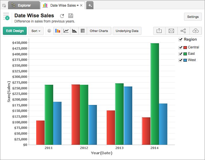
Legend in a chart provides a quick overview of the different data series involved in the chart along with the color associated with each series. Legend consists of Legend Title and Legend Items . Each legend item consists of a colored box that indicates the data series and the name of the data series.
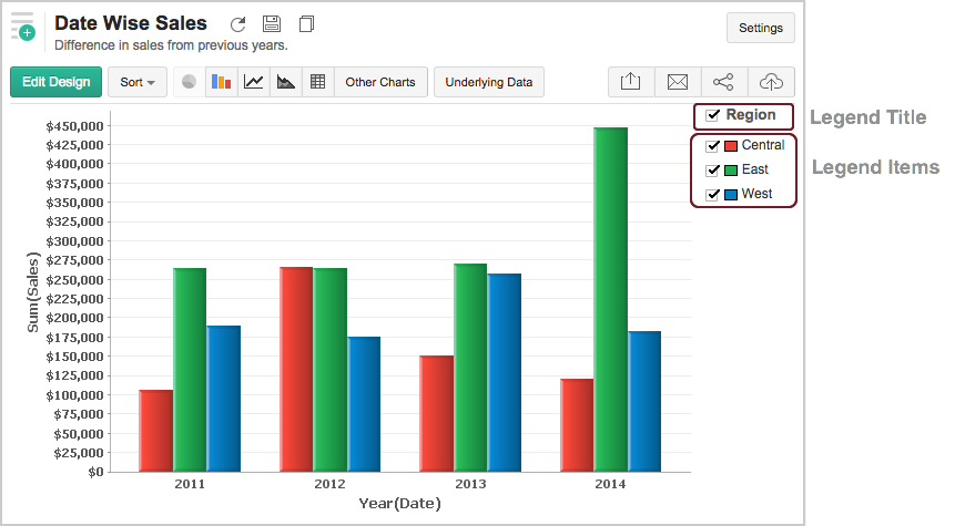
In Zoho Report, by default the legend will be placed on the right side of the chart and legend items will be added to it depending on the data series involved in the chart. You can customize the legend position, legend title, legend filters and the colors of each data series easily.
To customize the legend:
- Open the corresponding chart and click Settings option in the toolbar.
- The Settings screen will open. Click the Legend tab.
- The Legend tab provides various options to customize the legend properties. Set the options as required and then click Apply .
The following screenshot illustrates the Legend tab.
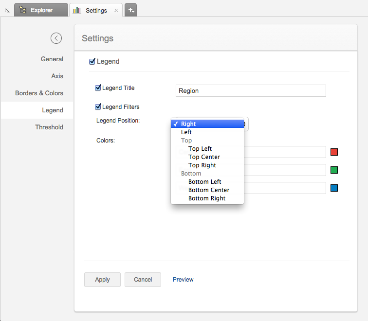
The following table describes the options available in the Legend tab:
| OPTION | DESCRIPTION |
| Show Legend | This option allow you to show or hide the legend in your chart |
| Show Legend Title | This option allow you to show or hide the legend title in the chart. You can also change the default title of the legend by typing in the title you want in to the Legend Title text box. |
| Show Legend Filters | This option allows you to add Legend Filters which enables your chart users to dynamically filter the data series using the legend items. On selecting this option a check box will be added to each legend item. Refer here to know how to use the Legend filters to filter a data series. |
| Legend Position | This option allows you to set the position of the Legend in a chart. Supported positions are : · Right · Left · Top-Left · Top-Center · Top-Right · Bottom-Left · Bottom-Center · Bottom-Right |
The following screen shot illustrates the resulting legend, when Show Legend Title and Legend Filters options are selected and Legend Position is set to Bottom Left .
You can also change the color of each data series using the corresponding legend item in Chart Edit Mode. Refer to the Customizing Chart Colors section to know how to customize chart color using legend.
Virtutem Analytics provides you an option to draw threshold lines in a chart to highlight specific values. Threshold lines can be added horizontally or vertically at a fixed value on the X or Y-axis of a chart. A threshold will be useful to highlight specific values for better visualization and for comparing the data series. For example, you can set a threshold line to represent maximum sale target, and another to represent the lowest acceptable sales target to spot regions that are out of sales target easily. Virtutem Analytics allows adding up to four threshold lines in a chart.
To add a threshold in your chart:
- Open the corresponding chart and then click Settings option in the toolbar.
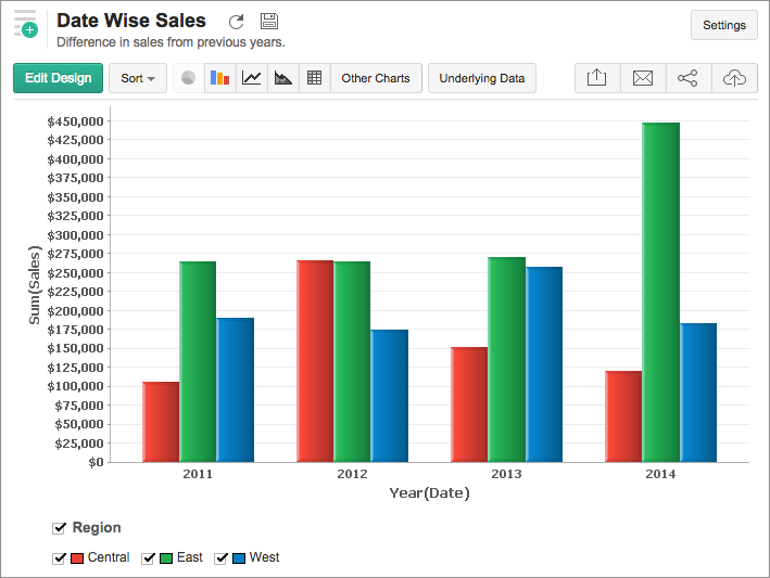
- Click the Threshold tab in the Settings screen.
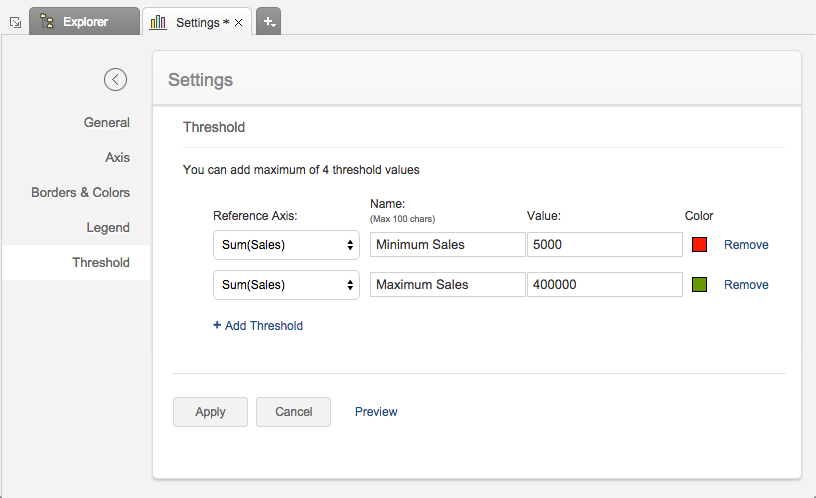
- Add a threshold value by selecting a reference axis in the Reference Axis drop-down.
- Enter the desired name of the threshold line in the Name text box.
- Enter the value of data point at which you want to draw a horizontal/vertical line in your chart in the Value text box.
- Virtutem Analytics will automatically set threshold color. You can also change the default color using the color picker.
- You can add more thresholds using the +Add Threshold link.
- Click Apply once you have added required threshold lines.
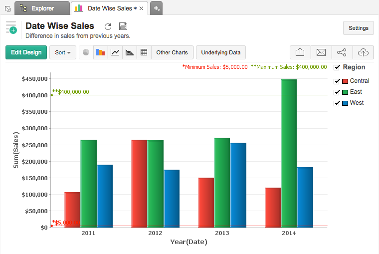
The following screenshot illustrates a chart with two threshold lines.
You can remove an existing threshold any time using the Remove link next to the corresponding threshold in Settings screen.
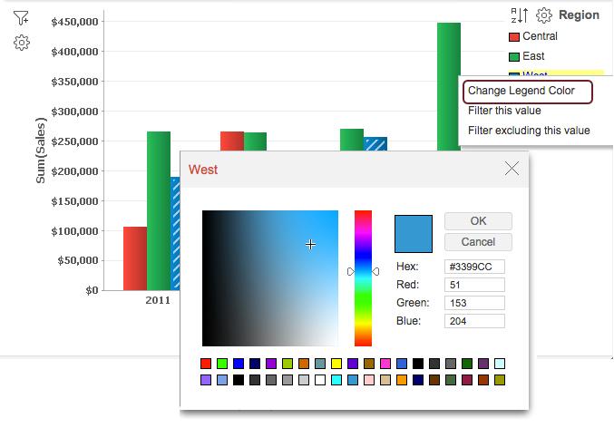
In Virtutem Analytics, when you create a chart, colors to represent the various data series involved will be automatically added to your chart. However, you can change the default colors of the data series.
To customize the data series colors in your chart:
- Open your chart in Edit Design Mode .
- Click on the color box of the legend item of the data series for which you want to change the color.
- Select Change the Legend Color option in the menu that shows up.
- A color picker dialog opens. Choose the required color from the full range of colors available. You can also specify the color by specifying the RGB value or the Hexadecimal value in the corresponding fields provided.
- Click OK after choosing the required color.
The newly chosen color will show up in your chart for the corresponding data series as shown below.
Note: |
|---|
You can also customize the color of the single data series using the Chart Color Fill option in the Borders & Colors tab in Settings screen. |