Working with Charts
Virtutem Analytics offers a wide range of interactive options on a chart when accessed by a end-user. The options include interactive chart highlighting, changing chart type, dynamic filtering of data displayed, sorting, viewing underlying data, exporting of charts, sharing and publishing. In this section we will discuss about each of these options in detail.
Virtutem Analytics provides interactive on-mouse-over effects in a chart. You can mouse-over a particular data point in the chart to highlight the corresponding point or view the corresponding data as tooltip. You can also mouse-over a data series provided in the legend to highlight the corresponding data series in the Chart. Refer to the following screenshots which exhibit the on-mouse-over interactive option.
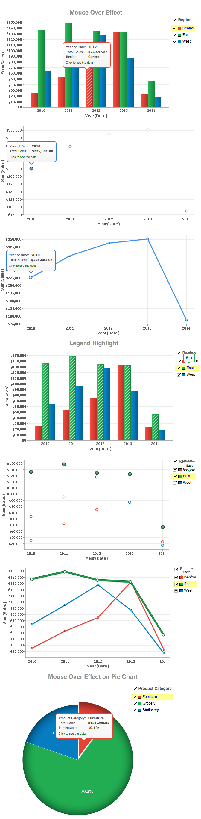
When designing a chart, if you have enabled Show Legend Filter option in Settings -> Legend tab (Refer here), a check box next to each legend item will be added as shown below.
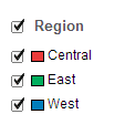
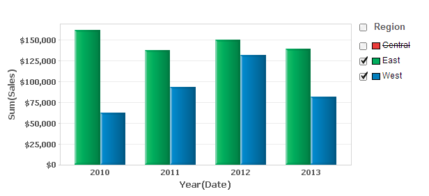
If Legend Filters are exposed then users of the chart can dynamically filter the data series in a chart by selecting/deselecting the corresponding legend item connected to the data series. For instance, in a chart that displays date wise sales in each region, if you want to display only East and West region data, hover the mouse on the legend and deselect the Central legend item. This removes the Central region data and will dynamically regenerate the chart with the remaining data as shown below.
Incase, if you want to select/deselect all legends items at a time, select the check box provided adjacent to the legend title.
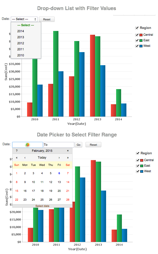
In Virtutem Analytics, chart owners can add User Filters to their charts, to provide dynamic filtering capability to the users. User Filters in a chart enables users to dynamically filter the data displayed in the chart by selecting or deselecting the appropriate values in the filter columns provided.
Following is brief description on how to use the provided user filters for various column types:
Date type columns:
Incase of a user filter on a Date type column, options to select date ranges or a multiple select combo box to select the required dates will be provided to allow users to select values depending on the component type chosen by the chart owner.
To filter displayed chart data using User Filter provided on a Date type column, do the following:
- Select a date range either by typing in the date or by choosing the date with the calender picker.
- If a filter drop down list has been provided, multiple dates can be selected by checking the boxes next to the required date.
- Click OK to apply filter.
Numeric type columns:
Incase of a user filter on a Numeric type column, a slider or a multiple select combo box will be provided to allow users to select values depending on the component type chosen by the chart owner.
To filter displayed chart data using User Filter provided on a Numeric type column, do the following:
- Choose a specific numeric range by adjusting the slider bars accordingly.
- If a filter drop down list has been provided, multiple values can be selected by selecting the boxes next to the filter items.
- Click OK to apply filter.
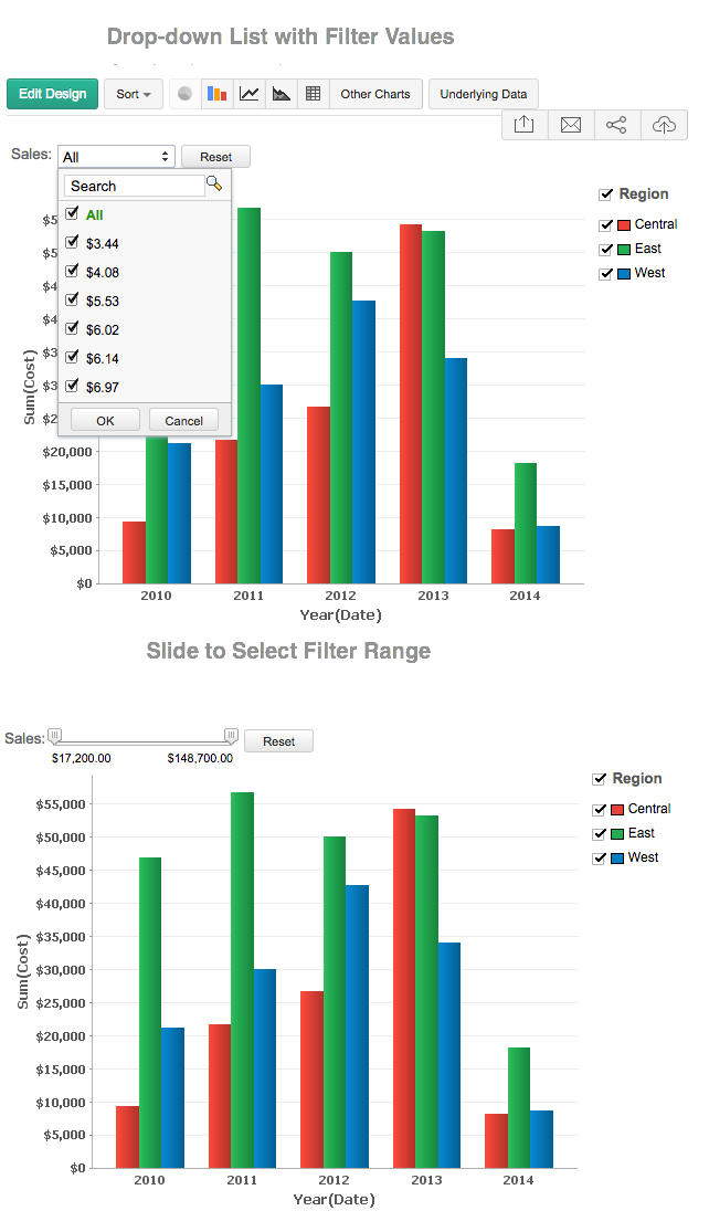
Category(String) type columns:
Incase of a user filter on a Category(String) type column, a single or multiple select drop down box will be provided to select values depending on the component type chosen by the chart owner.
To filter displayed chart data using User Filter provided on a Category/String type column, do the following:
- Invoke the filter drop down list containing the filter values.
- Select the required filter values in the filter drop down list.
- If the filter drop down list provides check boxes next to the filter items, multiple values can be selected simultaneously as shown below.
- Click OK to apply the filter.
.png)
Select Others filter item, if you want to display data corresponding to all other remaining items that are not listed in the user filter drop down.
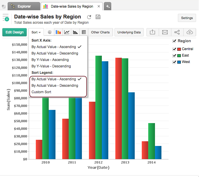
By default, chart data will be sorted in ascending order by the actual values of the Category/Date column i.e., alphabetically [A to Z] if it is a Category/String type column, earliest date to latest date if it is a Date type column. Apart from this, Virtutem Analytics offers various options in charts to sort the axis data, including custom sort, to meet your needs.
You can sort the chart by invoking the Sort option in the toolbar and choosing the appropriate option in the list given. Below is a brief discussion of various sort options available in Virtutem Analytics.
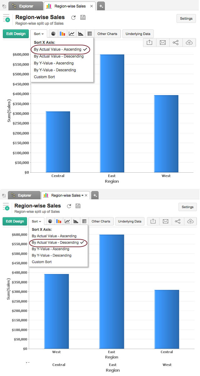
Sorting based on Actual Values:
When your chart contains Category (String) or Date column in one of the axes but not in both, you can sort the chart data based on actual value either in ascending or in descending order.
Steps to sort chart by actual values:
- Open the Chart to sort.
- Click the Sort button in the toolbar and then click By Actual Value - Ascending or By Actual Value - Descending . The chart data will be rearranged based on the option you choose.
If the axis value is a Category (String) column, then the values will be sorted alphabetically in ascending or descending order based on the option chosen. If it’s a Date column, then the values will be sorted from earliest to latest or the reverse based on the option chosen.
For example if a chart displays total amount of sales in each region, initially the regions are ordered alphabetically in the ascending order. When you sort the chart with Sort By Actual Value - Descending option, the resultant chart will be as shown below.
Sorting by Y or X Value:
When your chart contains Category (String) or Date column in one of the axes and Numeric column in the other, you can sort the values in the String/Date column based on the values in the numeric column. This is called Sort by Axis Value option. This option will be displayed as Sort by Y-value or X-value in the Sort menu, based on whether the Y axis contains the numeric column or the X axis.
Options when Y- axis has numeric column and X- axis has String/Date column:
- By Y-value - Ascending : Orders the values in X-axis based on Y-values sorted from smallest to largest.
- By Y-value - Descending : Orders the values in X-axis based on Y-values sorted from largest to smallest.
Options when X-axis has numeric column and Y-axis has String/Date column:
- By X-value - Ascending: Orders values in Y-axis based on X-values sorted from smallest to largest.
- By X-value - Descending: Orders values in Y-axis based on X-values sorted from largest to smallest.
Steps to sort charts by one of the axes value:
- Open the Chart to sort.
- Click the Sort button in the toolbar and then click By Y-Value - Ascending or By Y-Value - Descending. After selecting one of the sort options, chart data will be rearranged based on the option you choose.
For example if a chart displays yearly sales, by default the years are ordered from earliest to latest date. But the data becomes more organized when you sort Date with reference to the sales data in each year. Following screen shot displays chart with date values ordered based on the sales values.
When your chart contains Category (String) column in one of the axes and Numeric column in the other, you can sort the chart based on your own custom defined order. This is called Custom Sort.
For example if a chart displays medals won by each country in Athletics. By default this will be ordered alphabetically in ascending order (like Bronze, Gold & Silver). Using custom sort, you can order the medals in a natural priority order like Gold, Silver and Bronze, irrespective of the alphabetical order as shown below.
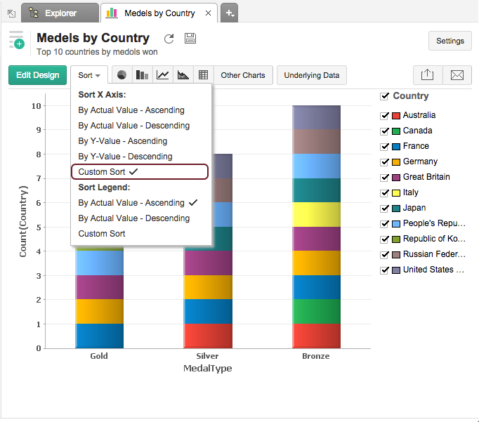
Steps to sort chart by your own custom defined order:
- Open the Chart to sort.
- Click the Sort button in the toolbar and then click Custom Sort . The Custom Sort Order dialog box will open.
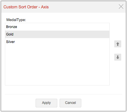
- Order the column values listed using the arrow keys provided or by drag and drop.
Note: The Custom Sort Order dialog box will list all values in the column. The filter criteria applied on the chart will not be applied here.In case the value is no longer available in the underlying data, you will find an option to delete it from the Charts custom sort dialog.
- Select the Make this Global check box, if you want to set this order as the default, when custom sort is applied for this column (in this chart or any other chart in which this column is part of). Setting this option will also override the sort order in any chart already created, with global custom order set based on this column.
- Click Apply button, the chart will be organized as you define.
When you share the chart, the order that you have defined will be set as the custom sort order for your shared users. They cannot define/modify the custom sort order. When you share the data tables to users for creating their own chart, then the user can define their own custom sort order for the chart they create.
| Couple of Points to Note on Sorting: |
|---|
Sort option will be enabled only when a Category or Date column is plotted along either X or Y axis but not both. In case of a chart having multiple Y-axes, sorting is allowed only if you have a category or date column in the X-axis. Sort by Value options will be disabled in case of multiple Y-axes charts. |
Legend Sorting
Virtutem Analytics also provides option to sort the Chart Legend. You can sort the legend values by ascending and descending order. You can also apply a custom sort order for your chart legend.
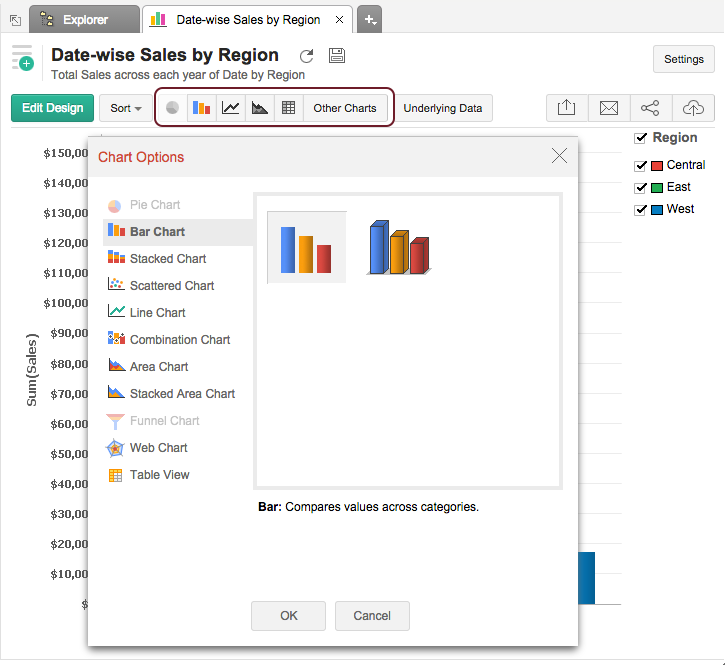
A chart can be easily changed to another chart type any time at a click of a button. Tool bar provides you with the options to choose between Pie, Bar, Stacked Bar, Line, Scatter and Table chart types at the top level. If you do not find the chart type that you are looking for, then click on Other Charts button in the toolbar and select the chart type that you want to apply, from the Chart Options dialog box that appears. After selecting the required chart type in the dialog box, click OK.
In Virtutem Analytics, when you create a Line, Scatter, Bar and Combination chart with multiple Y-axes, by default each Y-column will be plotted in its own axis i.e., with split (separate) axis as shown below. However, you can choose to combine/merge them so that all the Y-columns will be plotted against a single combined Y-axis scale. To merge split axis click Merge Axis button in the toolbar. Virtutem Analytics provides this as a toggle option to quickly switch between Split and Merge axis modes.
Following screen-shots displays charts, which compares Sales and Cost across date with Merged Axis and Split axis:
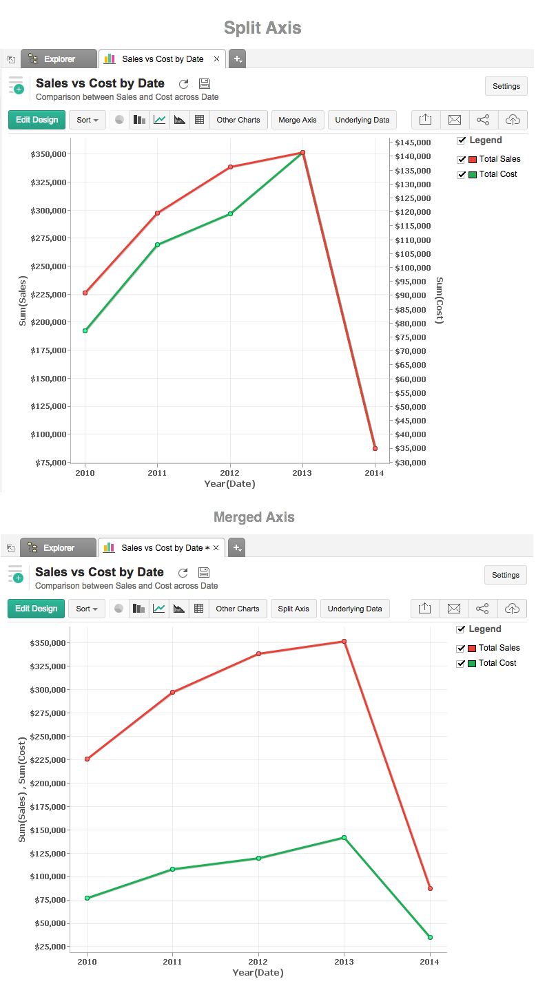
| Note: |
|---|
Chart with multiple Y-axes will be shared to users with Split or Merge axis based on the mode in which it was designed. |
Virtutem Analytics provides an option to view (drill into) the data that makes up the the chart using the option called View Underlying Data . This is also know as Data Drill Down option. You can click on any data point in the chart to view the underlying data of that corresponding point in a pop up table. You can also view the entire data making up the chart by clicking on the option View Underlying Data in the toolbar.
Following screen-shot shows the underlying sales data from Region "East" in the year "2010" displayed, when you click on the corresponding bar on the chart.
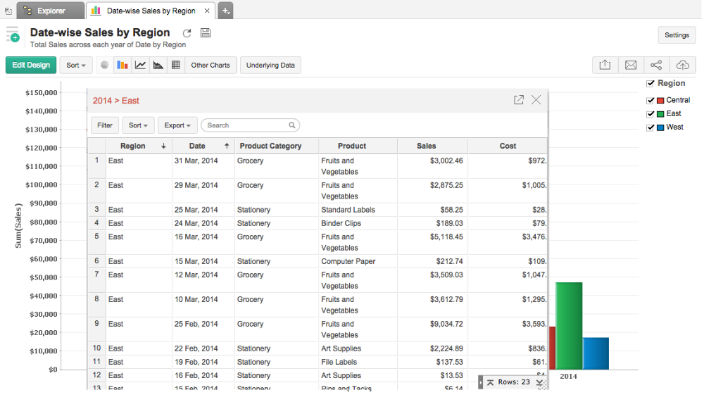
The table popup dialog showing the underlying data provides options to search, filter and sort the data displayed. You can also export the underlying data into variety of file formats like CSV, XLS, PDF and HTML.
Note |
|---|
View Underlying data option will be enabled only to users who have been provided that permission during sharing by the Administrator. Refer to the topic Sharing and Collaboration to know how to share your Charts. |
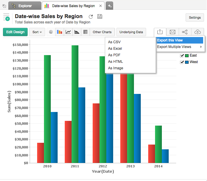
Virtutem Analytics allows you to export charts that you have created into various file formats like CSV, PDF, XLS, HTML or Image files. To export a chart:
- Open the chart that you would like to export
- Select Export button in the toolbar
- Select one of the five export format options:
- CSV - Exports the underlying data of the chart as a Comma Separated Value (CSV) file.
- PDF - Exports the chart in Portable Document Format (PDF) file format.
- HTML - Exports the chart in HTML file format.
- Excel (XLS) - Exports the underlying data of the chart as a Excel file.
- Image - Exports the chart as a GIF or PNG image.
- In the export settings window that opens, set the required options and then click Export button at the bottom to export.
In Virtutem Analytics you can easily share charts that you have created, for other users access. You can also set specific permissions on the shared charts, so that the users would be allowed to do only permitted actions when they access the chart. The various share options are provided under the Share menu in the toolbar.
Refer to the topic Sharing and Collaboration to know how to share your Charts.
| Note: |
|---|
Share option will be enabled only to users who have been provided that permission during sharing by the Administrator. |
Virtutem Analytics allows you to publish/embed charts that you have created, into your websites/web pages or as easy to access URLs. Virtutem Analytics also allows you to control the access privileges and permissions provided to the users who access the chart.
Refer to the topic Publishing Options to know how to Publish your Charts.
| Note: |
|---|
| This option will be enabled only to Administrator and Database Owners of the reporting database. |